

概述
本指南演示如何使用深度智能体构建数据分析智能体。数据分析任务通常需要规划、代码执行以及处理脚本、报告和图表等产物——这些都是深度智能体旨在处理的能力。 我们将构建的智能体将:- 接受 CSV 文件进行分析
- 执行探索性数据分析并生成可视化
- 将结果分享到 Slack 频道
Slack 集成是可选的。可以修改智能体以在本地保存产物或通过其他渠道分享结果。
关键概念
本教程涵盖:设置
安装
安装核心依赖:pip
pip install deepagents
可选依赖
本教程中我们将使用:- Slack Python SDK 用于分享结果(Token 设置)
- 用于代码执行的沙箱环境。设置详情请参见可用提供商
pip
pip install slack-sdk
These services are optional, though a sandboxed environment is highly recommended for any production use. You can alternatively use the local shell backend (with important security considerations) or download artifacts directly from the backend.
LangSmith
Many of the applications you build with LangChain will contain multiple steps with multiple invocations of LLM calls. As these applications get more complex, it becomes crucial to be able to inspect what exactly is going on inside your chain or agent. The best way to do this is with LangSmith. After you sign up at the link above, make sure to set your environment variables to start logging traces:export LANGSMITH_TRACING="true"
export LANGSMITH_API_KEY="..."
import getpass
import os

os.environ["LANGSMITH_TRACING"] = "true"
os.environ["LANGSMITH_API_KEY"] = getpass.getpass()
设置后端
深度智能体使用后端在沙箱化环境中执行代码。 设置详情请参见可用提供商。- Daytona
- Modal
- Runloop
- AgentCore
- Local shell
pip install langchain-daytona
uv add langchain-daytona
from daytona import Daytona

from langchain_daytona import DaytonaSandbox

sandbox = Daytona().create()
backend = DaytonaSandbox(sandbox=sandbox)
result = backend.execute("echo ready")
print(result)
# ExecuteResponse(output='ready', exit_code=0, ...)
import modal

from langchain_modal import ModalSandbox

app = modal.App.lookup("your-app")
modal_sandbox = modal.Sandbox.create(app=app)
backend = ModalSandbox(sandbox=modal_sandbox)
pip install langchain-runloop
uv add langchain-runloop
from runloop_api_client import RunloopSDK

from langchain_runloop import RunloopSandbox

api_key = "..."
client = RunloopSDK(bearer_token=api_key)

devbox = client.devbox.create()
backend = RunloopSandbox(devbox=devbox)
pip install langchain-agentcore-codeinterpreter
uv add langchain-agentcore-codeinterpreter
from bedrock_agentcore.tools.code_interpreter_client import CodeInterpreter
from langchain_agentcore_codeinterpreter import AgentCoreSandbox

interpreter = CodeInterpreter(region="us-west-2")
interpreter.start()
backend = AgentCoreSandbox(interpreter=interpreter)
This backend provides unrestricted filesystem and shell access. Use only in controlled environments for development and testing. See the security considerations for more details.
from deepagents.backends import LocalShellBackend

backend = LocalShellBackend(root_dir=".", env={"PATH": "/usr/bin:/bin"})
上传示例数据
创建并上传示例销售数据到后端:import csv
import io
# Create sample sales data
data = [
["Date", "Product", "Units Sold", "Revenue"],
["2025-08-01", "Widget A", 10, 250],
["2025-08-02", "Widget B", 5, 125],
["2025-08-03", "Widget A", 7, 175],
["2025-08-04", "Widget C", 3, 90],
["2025-08-05", "Widget B", 8, 200],
]
# Convert to CSV bytes
text_buf = io.StringIO()
writer = csv.writer(text_buf)
writer.writerows(data)
csv_bytes = text_buf.getvalue().encode("utf-8")
text_buf.close()
# Upload to backend
backend.upload_files([("/home/daytona/data/sales_data.csv", csv_bytes)])
实现自定义工具
数据分析任务可能会生成产物,如报告或图表。 下面这个简单的工具使用backend.download_files 下载它们,然后使用 Slack SDK 上传。
我们也可以让智能体列出相关文件路径而不是上传,这样相关人员可以根据需要单独获取。
from langchain.tools import tool
from slack_sdk import WebClient


slack_token = os.environ["SLACK_USER_TOKEN"]
slack_client = WebClient(token=slack_token)


@tool(parse_docstring=True)
def slack_send_message(text: str, file_path: str | None = None) -> str:
    """Send message, optionally including attachments such as images.

    Args:
        text: (str) text content of the message
        file_path: (str) file path of attachment in the filesystem.
    """
    if not file_path:
        slack_client.chat_postMessage(channel=channel, text=text)
    else:
        fp = backend.download_files([file_path])
        slack_client.files_upload_v2(
            channel="C0123456ABC",  # specify your own channel here
            content=fp[0].content,
            initial_comment=text,
        )

    return "Message sent."
It is generally good practice to avoid adding credentials and other secrets to the sandbox. Here we manage the Slack token outside the sandbox in a tool.
运行智能体
让我们实例化一个智能体:from langchain_core.utils.uuid import uuid7
from langgraph.checkpoint.memory import InMemorySaver
from deepagents import create_deep_agent
checkpointer = InMemorySaver()
agent = create_deep_agent(
model="google_genai:gemini-3.1-pro-preview",
tools=[slack_send_message],
backend=backend,
checkpointer=checkpointer,
)
thread_id = str(uuid7())
config={"configurable": {"thread_id": thread_id}}
- A choice of model
- Our custom tool
- The backend
- A checkpointer to support multi-turn conversations
input_message = {
    "role": "user",
    "content": (
        "Analyze ./data/sales_data.csv in the current dir and generate a beautiful plot. "
        "When finished, send your analysis and the plot to Slack using the tool."
    ),
}
for step in agent.stream(
    {"messages": [input_message]},
    config,
    stream_mode="updates",
):
    for _, update in step.items():
        if update and (messages := update.get("messages")) and isinstance(messages, list):
            for message in messages:
                message.pretty_print()
================================== Ai Message ==================================

[{'text': "I'll help you analyze the sales data and create a beautiful plot, then send the results to Slack. Let me start by exploring the data.", 'type': 'text'}, {'id': 'toolu_01LRot5h6WkhdpDQ1SG6EQGQ', 'input': {'file_path': './data/sales_data.csv'}, 'name': 'read_file', 'type': 'tool_use'}]
Tool Calls:
  read_file (toolu_01LRot5h6WkhdpDQ1SG6EQGQ)
 Call ID: toolu_01LRot5h6WkhdpDQ1SG6EQGQ
  Args:
    file_path: ./data/sales_data.csv
================================= Tool Message =================================
Name: read_file

Error: File '/data/sales_data.csv' not found
================================== Ai Message ==================================

[{'text': 'Let me check the current directory structure first:', 'type': 'text'}, {'id': 'toolu_018DSeF8Dx714Dh2M5vJ1JuK', 'input': {'command': 'pwd'}, 'name': 'execute', 'type': 'tool_use'}, {'id': 'toolu_01As782aRsVB3mJpKPKNwg9c', 'input': {'path': '/'}, 'name': 'ls', 'type': 'tool_use'}]
Tool Calls:
  execute (toolu_018DSeF8Dx714Dh2M5vJ1JuK)
 Call ID: toolu_018DSeF8Dx714Dh2M5vJ1JuK
  Args:
    command: pwd
  ls (toolu_01As782aRsVB3mJpKPKNwg9c)
 Call ID: toolu_01As782aRsVB3mJpKPKNwg9c
  Args:
    path: /
================================= Tool Message =================================
Name: execute

/home/daytona
[Command succeeded with exit code 0]
================================= Tool Message =================================
Name: ls

['/bin', '/boot', '/dev', '/etc', '/home', '/lib', '/lib64', '/media', '/mnt', '/opt', '/proc', '/root', '/run', '/sbin', '/srv', '/sys', '/tmp', '/usr', '/var', '/.dockerenv']
================================== Ai Message ==================================

[{'id': 'toolu_01Sv4ut1P2XFsjrzVmQbJLpr', 'input': {'path': '/home/daytona'}, 'name': 'ls', 'type': 'tool_use'}]
Tool Calls:
  ls (toolu_01Sv4ut1P2XFsjrzVmQbJLpr)
 Call ID: toolu_01Sv4ut1P2XFsjrzVmQbJLpr
  Args:
    path: /home/daytona
================================= Tool Message =================================
Name: ls

['/home/daytona/.bash_logout', '/home/daytona/.bashrc', '/home/daytona/.face', '/home/daytona/.face.icon', '/home/daytona/.profile', '/home/daytona/.daytona', '/home/daytona/data', '/home/daytona/.zshrc']
================================== Ai Message ==================================

[{'text': "Great! I can see there's a data directory. Let me check its contents:", 'type': 'text'}, {'id': 'toolu_01WN6V9RZjGGoDXzuWdEgB1z', 'input': {'path': '/home/daytona/data'}, 'name': 'ls', 'type': 'tool_use'}]
Tool Calls:
  ls (toolu_01WN6V9RZjGGoDXzuWdEgB1z)
 Call ID: toolu_01WN6V9RZjGGoDXzuWdEgB1z
  Args:
    path: /home/daytona/data
================================= Tool Message =================================
Name: ls

['/home/daytona/data/sales_data.csv']
================================== Ai Message ==================================

[{'text': 'Perfect! Now let me read the sales data:', 'type': 'text'}, {'id': 'toolu_01RFmneg7mua1G5csH3rH2Zq', 'input': {'file_path': '/home/daytona/data/sales_data.csv'}, 'name': 'read_file', 'type': 'tool_use'}]
Tool Calls:
  read_file (toolu_01RFmneg7mua1G5csH3rH2Zq)
 Call ID: toolu_01RFmneg7mua1G5csH3rH2Zq
  Args:
    file_path: /home/daytona/data/sales_data.csv
================================= Tool Message =================================
Name: read_file

     1	Date,Product,Units Sold,Revenue
     2	2025-08-01,Widget A,10,250
     3	2025-08-02,Widget B,5,125
     4	2025-08-03,Widget A,7,175
     5	2025-08-04,Widget C,3,90
     6	2025-08-05,Widget B,8,200
================================== Ai Message ==================================

[{'text': "Excellent! I can see the sales data. Now I'll create a Python script to analyze the data and generate a beautiful plot. Let me create a comprehensive analysis with visualizations:", 'type': 'text'}, {'id': 'toolu_01JcBjEXgPpCPuaGxn9ALwMg', 'input': {'file_path': '/home/daytona/analyze_sales.py', 'content': 'import pandas as pd\nimport matplotlib.pyplot as plt\nimport seaborn as sns\nfrom datetime import datetime\n\n# Set style for beautiful plots\nsns.set_style("whitegrid")\nplt.rcParams[\'figure.figsize\'] = (14, 10)\nplt.rcParams[\'font.size\'] = 11\n\n# Read the data\ndf = pd.read_csv(\'/home/daytona/data/sales_data.csv\')\ndf[\'Date\'] = pd.to_datetime(df[\'Date\'])\n\n# Analysis\nprint("=" * 60)\nprint("SALES DATA ANALYSIS REPORT")\nprint("=" * 60)\nprint("\\n1. DATA OVERVIEW")\nprint("-" * 60)\nprint(f"Date Range: {df[\'Date\'].min().strftime(\'%Y-%m-%d\')} to {df[\'Date\'].max().strftime(\'%Y-%m-%d\')}")\nprint(f"Total Records: {len(df)}")\nprint(f"Products: {\', \'.join(df[\'Product\'].unique())}")\n\nprint("\\n2. SUMMARY STATISTICS")\nprint("-" * 60)\nprint(f"Total Revenue: ${df[\'Revenue\'].sum():,.2f}")\nprint(f"Total Units Sold: {df[\'Units Sold\'].sum()}")\nprint(f"Average Daily Revenue: ${df[\'Revenue\'].mean():.2f}")\nprint(f"Average Units per Sale: {df[\'Units Sold\'].mean():.2f}")\n\nprint("\\n3. PRODUCT PERFORMANCE")\nprint("-" * 60)\nproduct_stats = df.groupby(\'Product\').agg({\n    \'Revenue\': [\'sum\', \'mean\'],\n    \'Units Sold\': [\'sum\', \'mean\']\n}).round(2)\nprint(product_stats)\n\nprint("\\n4. BEST PERFORMING DAY")\nprint("-" * 60)\nbest_day = df.loc[df[\'Revenue\'].idxmax()]\nprint(f"Date: {best_day[\'Date\'].strftime(\'%Y-%m-%d\')}")\nprint(f"Product: {best_day[\'Product\']}")\nprint(f"Revenue: ${best_day[\'Revenue\']:.2f}")\nprint(f"Units Sold: {best_day[\'Units Sold\']}")\n\n# Create visualizations\nfig = plt.figure(figsize=(16, 12))\nfig.suptitle(\'Sales Data Analysis Dashboard\', fontsize=20, fontweight=\'bold\', y=0.995)\n\n# 1. Revenue by Date\nax1 = plt.subplot(2, 3, 1)\ncolors = sns.color_palette("husl", len(df))\nbars = ax1.bar(df[\'Date\'].dt.strftime(\'%m-%d\'), df[\'Revenue\'], color=colors, edgecolor=\'black\', linewidth=1.5)\nax1.set_title(\'Daily Revenue\', fontsize=14, fontweight=\'bold\', pad=10)\nax1.set_xlabel(\'Date\', fontsize=12, fontweight=\'bold\')\nax1.set_ylabel(\'Revenue ($)\', fontsize=12, fontweight=\'bold\')\nax1.grid(axis=\'y\', alpha=0.3)\nfor bar in bars:\n    height = bar.get_height()\n    ax1.text(bar.get_x() + bar.get_width()/2., height,\n            f\'${int(height)}\',\n            ha=\'center\', va=\'bottom\', fontsize=9, fontweight=\'bold\')\nplt.setp(ax1.xaxis.get_majorticklabels(), rotation=45)\n\n# 2. Units Sold by Date\nax2 = plt.subplot(2, 3, 2)\nbars = ax2.bar(df[\'Date\'].dt.strftime(\'%m-%d\'), df[\'Units Sold\'], color=colors, edgecolor=\'black\', linewidth=1.5)\nax2.set_title(\'Daily Units Sold\', fontsize=14, fontweight=\'bold\', pad=10)\nax2.set_xlabel(\'Date\', fontsize=12, fontweight=\'bold\')\nax2.set_ylabel(\'Units\', fontsize=12, fontweight=\'bold\')\nax2.grid(axis=\'y\', alpha=0.3)\nfor bar in bars:\n    height = bar.get_height()\n    ax2.text(bar.get_x() + bar.get_width()/2., height,\n            f\'{int(height)}\',\n            ha=\'center\', va=\'bottom\', fontsize=9, fontweight=\'bold\')\nplt.setp(ax2.xaxis.get_majorticklabels(), rotation=45)\n\n# 3. Revenue by Product (Pie Chart)\nax3 = plt.subplot(2, 3, 3)\nproduct_revenue = df.groupby(\'Product\')[\'Revenue\'].sum()\ncolors_pie = sns.color_palette("Set2", len(product_revenue))\nwedges, texts, autotexts = ax3.pie(product_revenue, labels=product_revenue.index, autopct=\'%1.1f%%\',\n                                     colors=colors_pie, startangle=90, textprops={\'fontsize\': 11, \'fontweight\': \'bold\'},\n                                     explode=[0.05] * len(product_revenue))\nax3.set_title(\'Revenue Distribution by Product\', fontsize=14, fontweight=\'bold\', pad=10)\nfor autotext in autotexts:\n    autotext.set_color(\'white\')\n    autotext.set_fontsize(12)\n\n# 4. Total Revenue by Product (Bar Chart)\nax4 = plt.subplot(2, 3, 4)\nproduct_revenue_sorted = product_revenue.sort_values(ascending=False)\ncolors_product = sns.color_palette("coolwarm", len(product_revenue_sorted))\nbars = ax4.barh(product_revenue_sorted.index, product_revenue_sorted.values, color=colors_product, edgecolor=\'black\', linewidth=1.5)\nax4.set_title(\'Total Revenue by Product\', fontsize=14, fontweight=\'bold\', pad=10)\nax4.set_xlabel(\'Revenue ($)\', fontsize=12, fontweight=\'bold\')\nax4.set_ylabel(\'Product\', fontsize=12, fontweight=\'bold\')\nax4.grid(axis=\'x\', alpha=0.3)\nfor i, (product, revenue) in enumerate(product_revenue_sorted.items()):\n    ax4.text(revenue, i, f\' ${int(revenue)}\', va=\'center\', fontsize=10, fontweight=\'bold\')\n\n# 5. Total Units Sold by Product\nax5 = plt.subplot(2, 3, 5)\nproduct_units = df.groupby(\'Product\')[\'Units Sold\'].sum().sort_values(ascending=False)\ncolors_units = sns.color_palette("viridis", len(product_units))\nbars = ax5.barh(product_units.index, product_units.values, color=colors_units, edgecolor=\'black\', linewidth=1.5)\nax5.set_title(\'Total Units Sold by Product\', fontsize=14, fontweight=\'bold\', pad=10)\nax5.set_xlabel(\'Units\', fontsize=12, fontweight=\'bold\')\nax5.set_ylabel(\'Product\', fontsize=12, fontweight=\'bold\')\nax5.grid(axis=\'x\', alpha=0.3)\nfor i, (product, units) in enumerate(product_units.items()):\n    ax5.text(units, i, f\' {int(units)}\', va=\'center\', fontsize=10, fontweight=\'bold\')\n\n# 6. Product Distribution\nax6 = plt.subplot(2, 3, 6)\nproduct_counts = df[\'Product\'].value_counts()\ncolors_count = sns.color_palette("muted", len(product_counts))\nwedges, texts, autotexts = ax6.pie(product_counts, labels=product_counts.index, autopct=\'%1.1f%%\',\n                                     colors=colors_count, startangle=45, textprops={\'fontsize\': 11, \'fontweight\': \'bold\'},\n                                     explode=[0.05] * len(product_counts))\nax6.set_title(\'Sales Transactions by Product\', fontsize=14, fontweight=\'bold\', pad=10)\nfor autotext in autotexts:\n    autotext.set_color(\'white\')\n    autotext.set_fontsize(12)\n\nplt.tight_layout()\nplt.savefig(\'/home/daytona/sales_analysis_plot.png\', dpi=300, bbox_inches=\'tight\', facecolor=\'white\')\nprint("\\n" + "=" * 60)\nprint("Plot saved as: sales_analysis_plot.png")\nprint("=" * 60)\n'}, 'name': 'write_file', 'type': 'tool_use'}]
Tool Calls:
  write_file (toolu_01JcBjEXgPpCPuaGxn9ALwMg)
 Call ID: toolu_01JcBjEXgPpCPuaGxn9ALwMg
  Args:
    file_path: /home/daytona/analyze_sales.py
    content: import pandas as pd
import matplotlib.pyplot as plt
import seaborn as sns
from datetime import datetime

# Set style for beautiful plots
sns.set_style("whitegrid")
plt.rcParams['figure.figsize'] = (14, 10)
plt.rcParams['font.size'] = 11

# Read the data
df = pd.read_csv('/home/daytona/data/sales_data.csv')
df['Date'] = pd.to_datetime(df['Date'])

# Analysis
print("=" * 60)
print("SALES DATA ANALYSIS REPORT")
print("=" * 60)
print("\n1. DATA OVERVIEW")
print("-" * 60)
print(f"Date Range: {df['Date'].min().strftime('%Y-%m-%d')} to {df['Date'].max().strftime('%Y-%m-%d')}")
print(f"Total Records: {len(df)}")
print(f"Products: {', '.join(df['Product'].unique())}")

print("\n2. SUMMARY STATISTICS")
print("-" * 60)
print(f"Total Revenue: ${df['Revenue'].sum():,.2f}")
print(f"Total Units Sold: {df['Units Sold'].sum()}")
print(f"Average Daily Revenue: ${df['Revenue'].mean():.2f}")
print(f"Average Units per Sale: {df['Units Sold'].mean():.2f}")

print("\n3. PRODUCT PERFORMANCE")
print("-" * 60)
product_stats = df.groupby('Product').agg({
    'Revenue': ['sum', 'mean'],
    'Units Sold': ['sum', 'mean']
}).round(2)
print(product_stats)

print("\n4. BEST PERFORMING DAY")
print("-" * 60)
best_day = df.loc[df['Revenue'].idxmax()]
print(f"Date: {best_day['Date'].strftime('%Y-%m-%d')}")
print(f"Product: {best_day['Product']}")
print(f"Revenue: ${best_day['Revenue']:.2f}")
print(f"Units Sold: {best_day['Units Sold']}")

# Create visualizations
fig = plt.figure(figsize=(16, 12))
fig.suptitle('Sales Data Analysis Dashboard', fontsize=20, fontweight='bold', y=0.995)

# 1. Revenue by Date
ax1 = plt.subplot(2, 3, 1)
colors = sns.color_palette("husl", len(df))
bars = ax1.bar(df['Date'].dt.strftime('%m-%d'), df['Revenue'], color=colors, edgecolor='black', linewidth=1.5)
ax1.set_title('Daily Revenue', fontsize=14, fontweight='bold', pad=10)
ax1.set_xlabel('Date', fontsize=12, fontweight='bold')
ax1.set_ylabel('Revenue ($)', fontsize=12, fontweight='bold')
ax1.grid(axis='y', alpha=0.3)
for bar in bars:
    height = bar.get_height()
    ax1.text(bar.get_x() + bar.get_width()/2., height,
            f'${int(height)}',
            ha='center', va='bottom', fontsize=9, fontweight='bold')
plt.setp(ax1.xaxis.get_majorticklabels(), rotation=45)

# 2. Units Sold by Date
ax2 = plt.subplot(2, 3, 2)
bars = ax2.bar(df['Date'].dt.strftime('%m-%d'), df['Units Sold'], color=colors, edgecolor='black', linewidth=1.5)
ax2.set_title('Daily Units Sold', fontsize=14, fontweight='bold', pad=10)
ax2.set_xlabel('Date', fontsize=12, fontweight='bold')
ax2.set_ylabel('Units', fontsize=12, fontweight='bold')
ax2.grid(axis='y', alpha=0.3)
for bar in bars:
    height = bar.get_height()
    ax2.text(bar.get_x() + bar.get_width()/2., height,
            f'{int(height)}',
            ha='center', va='bottom', fontsize=9, fontweight='bold')
plt.setp(ax2.xaxis.get_majorticklabels(), rotation=45)

# 3. Revenue by Product (Pie Chart)
ax3 = plt.subplot(2, 3, 3)
product_revenue = df.groupby('Product')['Revenue'].sum()
colors_pie = sns.color_palette("Set2", len(product_revenue))
wedges, texts, autotexts = ax3.pie(product_revenue, labels=product_revenue.index, autopct='%1.1f%%',
                                     colors=colors_pie, startangle=90, textprops={'fontsize': 11, 'fontweight': 'bold'},
                                     explode=[0.05] * len(product_revenue))
ax3.set_title('Revenue Distribution by Product', fontsize=14, fontweight='bold', pad=10)
for autotext in autotexts:
    autotext.set_color('white')
    autotext.set_fontsize(12)

# 4. Total Revenue by Product (Bar Chart)
ax4 = plt.subplot(2, 3, 4)
product_revenue_sorted = product_revenue.sort_values(ascending=False)
colors_product = sns.color_palette("coolwarm", len(product_revenue_sorted))
bars = ax4.barh(product_revenue_sorted.index, product_revenue_sorted.values, color=colors_product, edgecolor='black', linewidth=1.5)
ax4.set_title('Total Revenue by Product', fontsize=14, fontweight='bold', pad=10)
ax4.set_xlabel('Revenue ($)', fontsize=12, fontweight='bold')
ax4.set_ylabel('Product', fontsize=12, fontweight='bold')
ax4.grid(axis='x', alpha=0.3)
for i, (product, revenue) in enumerate(product_revenue_sorted.items()):
    ax4.text(revenue, i, f' ${int(revenue)}', va='center', fontsize=10, fontweight='bold')

# 5. Total Units Sold by Product
ax5 = plt.subplot(2, 3, 5)
product_units = df.groupby('Product')['Units Sold'].sum().sort_values(ascending=False)
colors_units = sns.color_palette("viridis", len(product_units))
bars = ax5.barh(product_units.index, product_units.values, color=colors_units, edgecolor='black', linewidth=1.5)
ax5.set_title('Total Units Sold by Product', fontsize=14, fontweight='bold', pad=10)
ax5.set_xlabel('Units', fontsize=12, fontweight='bold')
ax5.set_ylabel('Product', fontsize=12, fontweight='bold')
ax5.grid(axis='x', alpha=0.3)
for i, (product, units) in enumerate(product_units.items()):
    ax5.text(units, i, f' {int(units)}', va='center', fontsize=10, fontweight='bold')

# 6. Product Distribution
ax6 = plt.subplot(2, 3, 6)
product_counts = df['Product'].value_counts()
colors_count = sns.color_palette("muted", len(product_counts))
wedges, texts, autotexts = ax6.pie(product_counts, labels=product_counts.index, autopct='%1.1f%%',
                                     colors=colors_count, startangle=45, textprops={'fontsize': 11, 'fontweight': 'bold'},
                                     explode=[0.05] * len(product_counts))
ax6.set_title('Sales Transactions by Product', fontsize=14, fontweight='bold', pad=10)
for autotext in autotexts:
    autotext.set_color('white')
    autotext.set_fontsize(12)

plt.tight_layout()
plt.savefig('/home/daytona/sales_analysis_plot.png', dpi=300, bbox_inches='tight', facecolor='white')
print("\n" + "=" * 60)
print("Plot saved as: sales_analysis_plot.png")
print("=" * 60)
================================= Tool Message =================================
Name: write_file

Updated file /home/daytona/analyze_sales.py
================================== Ai Message ==================================

[{'text': 'Now let me run the analysis script:', 'type': 'text'}, {'id': 'toolu_015xkZr21TuzCTEKGzSqgnbp', 'input': {'command': 'cd /home/daytona && python analyze_sales.py'}, 'name': 'execute', 'type': 'tool_use'}]
Tool Calls:
  execute (toolu_015xkZr21TuzCTEKGzSqgnbp)
 Call ID: toolu_015xkZr21TuzCTEKGzSqgnbp
  Args:
    command: cd /home/daytona && python analyze_sales.py
================================= Tool Message =================================
Name: execute

============================================================
SALES DATA ANALYSIS REPORT
============================================================

1. DATA OVERVIEW
------------------------------------------------------------
Date Range: 2025-08-01 to 2025-08-05
Total Records: 5
Products: Widget A, Widget B, Widget C

2. SUMMARY STATISTICS
------------------------------------------------------------
Total Revenue: $840.00
Total Units Sold: 33
Average Daily Revenue: $168.00
Average Units per Sale: 6.60

3. PRODUCT PERFORMANCE
------------------------------------------------------------
         Revenue        Units Sold
             sum   mean        sum mean
Product
Widget A     425  212.5         17  8.5
Widget B     325  162.5         13  6.5
Widget C      90   90.0          3  3.0

4. BEST PERFORMING DAY
------------------------------------------------------------
Date: 2025-08-01
Product: Widget A
Revenue: $250.00
Units Sold: 10

============================================================
Plot saved as: sales_analysis_plot.png
============================================================
[Command succeeded with exit code 0]
================================== Ai Message ==================================

[{'text': 'Perfect! The analysis is complete and the plot has been generated. Now let me send both the analysis and the plot to Slack:', 'type': 'text'}, {'id': 'toolu_01Qust5a8DECKPZuU9pBBvkz', 'input': {'text': '📊 **SALES DATA ANALYSIS REPORT** 📊\n\n**1. DATA OVERVIEW**\n• Date Range: August 1-5, 2025 (5 days)\n• Products Analyzed: Widget A, Widget B, Widget C\n\n**2. KEY METRICS**\n💰 Total Revenue: $840.00\n📦 Total Units Sold: 33 units\n📈 Average Daily Revenue: $168.00\n📊 Average Units per Sale: 6.60\n\n**3. PRODUCT PERFORMANCE**\n🏆 Widget A (Top Performer)\n   - Total Revenue: $425 (50.6% of total)\n   - Total Units Sold: 17 (avg 8.5 per transaction)\n\n🥈 Widget B\n   - Total Revenue: $325 (38.7% of total)\n   - Total Units Sold: 13 (avg 6.5 per transaction)\n\n🥉 Widget C\n   - Total Revenue: $90 (10.7% of total)\n   - Total Units Sold: 3 (avg 3.0 per transaction)\n\n**4. BEST PERFORMING DAY**\n🌟 August 1, 2025\n   - Product: Widget A\n   - Revenue: $250.00\n   - Units Sold: 10\n\n**KEY INSIGHTS:**\n✅ Widget A is the clear leader, generating over 50% of total revenue\n✅ Widget B shows strong performance with consistent sales\n⚠️ Widget C has potential for improvement - lowest sales and revenue\n📊 Daily revenue ranges from $90 to $250\n\nSee attached visualization dashboard for detailed charts! 📈', 'file_path': '/home/daytona/sales_analysis_plot.png'}, 'name': 'slack_send_message', 'type': 'tool_use'}]
Tool Calls:
  slack_send_message (toolu_01Qust5a8DECKPZuU9pBBvkz)
 Call ID: toolu_01Qust5a8DECKPZuU9pBBvkz
  Args:
    text: 📊 **SALES DATA ANALYSIS REPORT** 📊

**1. DATA OVERVIEW**
• Date Range: August 1-5, 2025 (5 days)
• Products Analyzed: Widget A, Widget B, Widget C

**2. KEY METRICS**
💰 Total Revenue: $840.00
📦 Total Units Sold: 33 units
📈 Average Daily Revenue: $168.00
📊 Average Units per Sale: 6.60

**3. PRODUCT PERFORMANCE**
🏆 Widget A (Top Performer)
   - Total Revenue: $425 (50.6% of total)
   - Total Units Sold: 17 (avg 8.5 per transaction)

🥈 Widget B
   - Total Revenue: $325 (38.7% of total)
   - Total Units Sold: 13 (avg 6.5 per transaction)

🥉 Widget C
   - Total Revenue: $90 (10.7% of total)
   - Total Units Sold: 3 (avg 3.0 per transaction)

**4. BEST PERFORMING DAY**
🌟 August 1, 2025
   - Product: Widget A
   - Revenue: $250.00
   - Units Sold: 10

**KEY INSIGHTS:**
✅ Widget A is the clear leader, generating over 50% of total revenue
✅ Widget B shows strong performance with consistent sales
⚠️ Widget C has potential for improvement - lowest sales and revenue
📊 Daily revenue ranges from $90 to $250

See attached visualization dashboard for detailed charts! 📈
    file_path: /home/daytona/sales_analysis_plot.png
================================= Tool Message =================================
Name: slack_send_message

Message sent.
================================== Ai Message ==================================

Excellent! I've successfully completed the analysis and sent everything to Slack. Here's what I did:

## Summary

**Analysis Completed:**
- Analyzed the sales data from August 1-5, 2025
- Processed data for 3 products (Widget A, B, and C)
- Generated comprehensive statistics and insights

**Key Findings:**
1. **Total Revenue:** $840 across 5 days
2. **Best Product:** Widget A ($425 revenue, 50.6% of total)
3. **Best Day:** August 1st with $250 in revenue
4. **Total Units Sold:** 33 units

**Visualization Created:**
A beautiful 6-panel dashboard featuring:
- Daily revenue trends
- Daily units sold
- Revenue distribution by product (pie chart)
- Total revenue by product (horizontal bar chart)
- Total units sold by product (horizontal bar chart)
- Sales transactions distribution (pie chart)

**Delivered to Slack:**
✅ Comprehensive analysis report with key metrics and insights
✅ High-resolution visualization dashboard (saved as PNG)

The analysis reveals that Widget A is the top performer, while Widget C shows room for improvement. All results have been sent to your Slack workspace!
结果
智能体成功分析了数据,并将包含可视化的全面报告分享到了 Slack: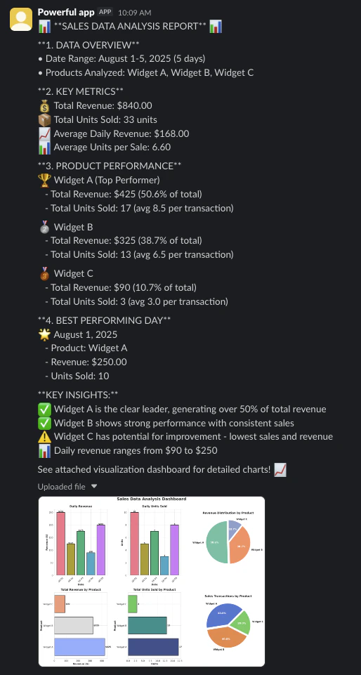
Agent-generated analysis report and visualization dashboard delivered to Slack
You can download artifacts directly from the backend without using external tools:
backend.download_files(list_of_filepaths)
See provider guides for how to clean up the sandbox once finished.
下一步
现在你已经构建了数据分析智能体,探索以下资源来扩展其能力:- Backends: Learn about the Deep Agents backend system
- Sandboxes: Review backends for sandboxed code execution, including security considerations and advanced configurations
- Customization: Discover how to customize your agent with different models, tools, prompts, and planning strategies
- CLI: Try the Deep Agents CLI as a terminal coding agent to assist with data analysis and other agentic tasks locally
- Skills: Equip your agent with reusable skills for common workflows
- Human-in-the-loop: Add interactive approval steps for critical operations in your data analysis workflow
连接这些文档到 Claude、VSCode 等工具,通过 MCP 获取实时答案。